Redesign my personal website using Hugo

It is natural for a developer to want to redesign his personal website. In fact, this is my fifth time redesigning my website 😆. These changes are usually based on various reasons. But, I did this for the reason of improving the user experience. And as a developer who isn’t very good at design, it took me some time to realize if my website needed a change. Until in the end I decided to make my website simpler than before.
How simple is my website?
Still the same as before, I made my website static. I’m also still using Hugo, with the help of Tailwind CSS. Previously there were four main colors for my website, now there are only three. I previously used three different fonts, now there are only two.
Picking colors is difficult
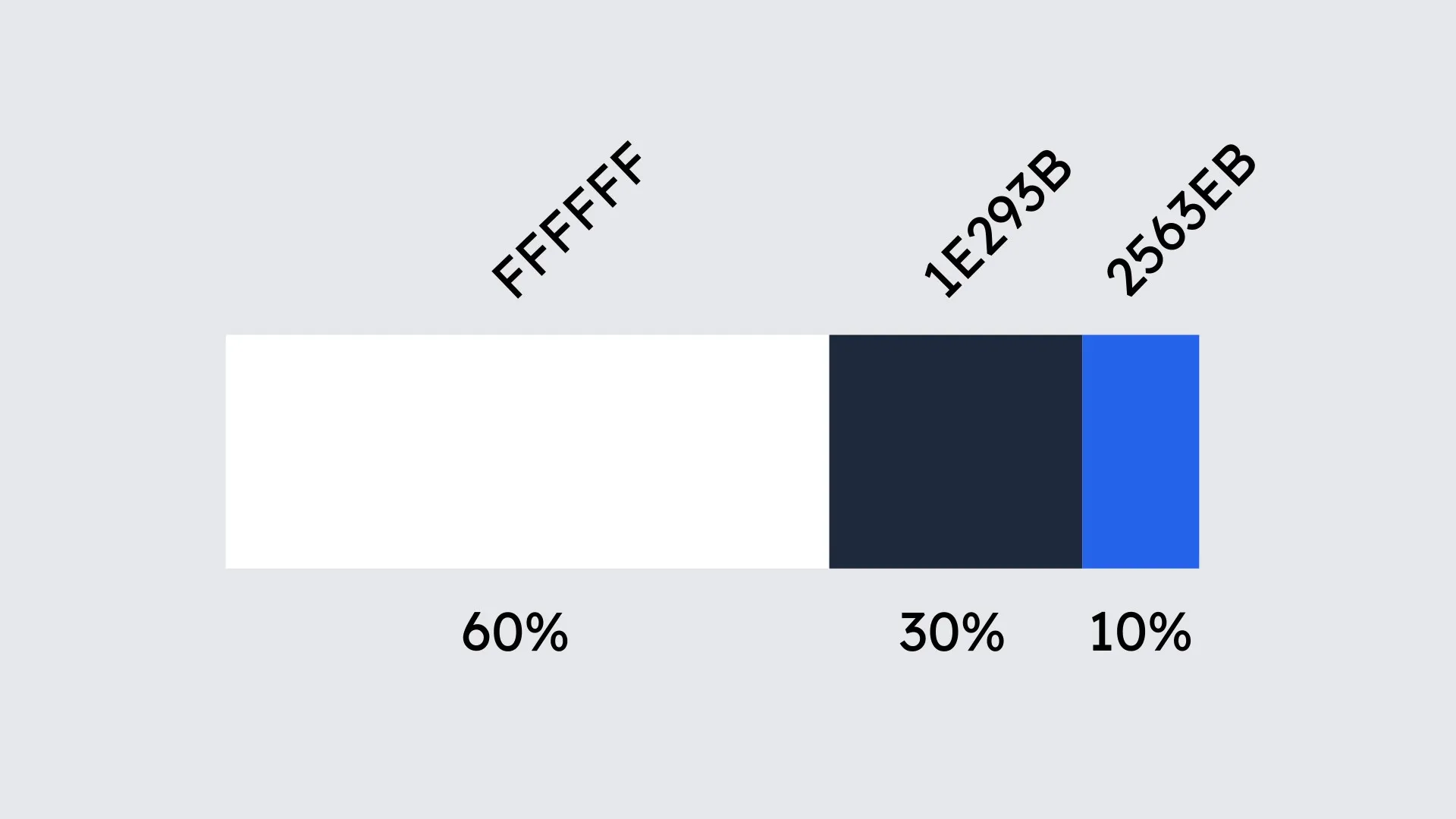
Everyone knows this, especially developers. After learning a little bit about UX design, I just found out there’s such a thing as 60-30-10 color theory. I tried to apply this, and as a result I decided to use the colors above. I chose blue as an accent because it contrasts so well with other colors. All the colors above I took from Tailwind CSS.
The complexity of fonts on the web
There are many ways to use fonts on a website. The best performing way is to use a system font. However, I think this method can be inconsistent, and also goes against the “don’t trust your users” principle. So, I chose to use web fonts from Google Fonts. I know this might not be the best choice. However, if you look at all the advantages and disadvantages, this is the most reasonable choice.
Previously I used three fonts, Lato, Playfair Display, and Fira Code. Despite the fact that this font may not be suitable for pairing, the use of Playfair Display as a serif font can also be removed. Now my website uses only two fonts, Lexend Deca and JetBrains Mono. I think using one font with different thickness is easier to pair. And as for JetBrains Mono, I myself use it in all the terminals and text editors I use, and so far I’ve had no problems.
I’m currently using only non-variable fonts. I’m still studying this topic which I find difficult, especially regarding compatibility with older web browsers. But in the future I will definitely use variable fonts on my website to make it faster and improve the user experience.
About design inspiration
The first website I always visit when I need design inspiration is Awwwards. However, I find most of the websites featured there are actually not user friendly. Most of them only care about design, not user experience. Having said that, I now prefer a UX designer portfolio as an inspiration instead. In my opinion, they are much more user experience savvy, while still maintaining a good design. Besides that, I’m also looking for an example of a developer portfolio as a reference. Below is some websites that gave me inspiration.
- https://reinink.ca
- https://www.joshwcomeau.com
- https://cherupil.com
- https://ghstcode.com
- https://www.krollstudio.com
You may find it difficult to find what inspiration I took from the websites above. But, thanks a lot to them, I was able to learn a lot of things.
What do you think?
With all the changes I’ve made to my website, what do you think? Has the design become too simple? Does my website have accessibility issues?
And finally, thanks for reading this.